
The History of Streetwear Logos: From Box Logo to No Logo
How streetwear logos evolved from Stussy's scrawl to Supreme's box to the no-logo movement. The cultural history of branding in street fashion and where it's heading.
The Logo Is the Message
In streetwear, the logo has always been more than a trademark. It is a signal. A tribal marker. A compressed message that communicates identity, affiliation, taste, and spending power in a single glance.
The history of streetwear is, in many ways, the history of its logos. From Shawn Stussy's hand-drawn signature to Supreme's Futura Heavy Oblique box logo to the deliberate logo-lessness of the quiet luxury movement, the way brands mark their products tells the story of how street culture thinks about identity, authenticity, and status.
This is that story.
The Founding Signatures: 1980s
Stussy: The Signature That Started It
Shawn Stussy did not design a logo. He signed his name. The Stussy signature — a flowing, graffiti-influenced autograph — was literally Shawn's handwriting, which he used to mark the surfboards he shaped in Laguna Beach, California.
When Stussy started printing that signature on tees and caps in the early 1980s, it carried personal authenticity that corporate logos could not replicate. This was not a design committee's output. It was one person's actual handwriting on a product they actually made.
The Stussy signature established a template that streetwear would follow for decades: the logo as personal expression, as proof of a real person behind the product.
The International Stussy Tribe
Stussy's other iconic logo — the interlocking SS — was inspired by the Chanel double-C. This was deliberate provocation. A surfer from California borrowing the visual language of Parisian haute couture was a statement about streetwear's ambitions and irreverence. It said: we belong in this conversation, and we will reference whoever we want.
The Golden Era: 1990s
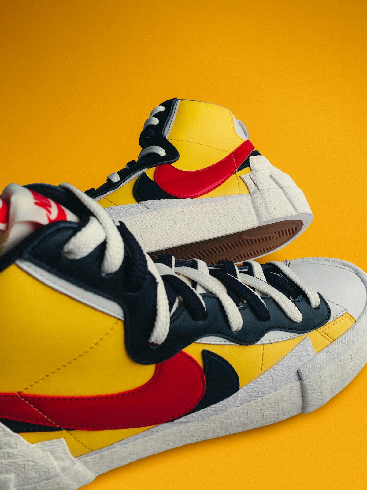
Supreme and the Box Logo
When James Jebbia founded Supreme in 1994, the brand needed an identity that could compete visually in a landscape of elaborate graffiti-influenced logos. The answer was radical simplicity: the word "Supreme" in white Futura Heavy Oblique italic on a red rectangle.
The box logo was inspired by — or lifted from, depending on your perspective — the work of artist Barbara Kruger, who used the same font in red rectangles for her political art. The reference was intentional and the implications were complex: a commercial brand adopting the visual language of anti-consumerist art. The irony was baked in from day one.
What made the box logo iconic was not the design itself but how Supreme controlled it. The box logo appeared on a limited number of products each season. Not every Supreme piece featured it. This scarcity within an already scarce brand created a hierarchy — box logo items were the grails, and everything else was supporting cast.
The Supreme box logo became the single most recognizable symbol in streetwear. And its influence — the idea that a simple, bold logo could carry enough cultural weight to justify a product's existence — reshaped the entire industry.
Compare Supreme's approach to our Stussy vs Palace vs Supreme breakdown for more on how these foundational brands use branding differently.
A Bathing Ape: The Mascot Approach
BAPE took a different approach entirely. Instead of text-based logos, Nigo created the Ape Head — a cartoon primate face that functioned as a mascot rather than a wordmark. The BAPE Ape Head, the Shark hoodie mouth, and the BAPESTA star were all character-driven design elements that turned every piece of clothing into a walking cartoon.
This mascot approach drew from Japanese pop culture's comfort with cute, character-driven design. It felt foreign and exciting in Western streetwear, where logos were either text-based (Supreme, Stussy) or abstract (Nike Swoosh). BAPE proved that a streetwear logo could be playful and still carry street credibility.
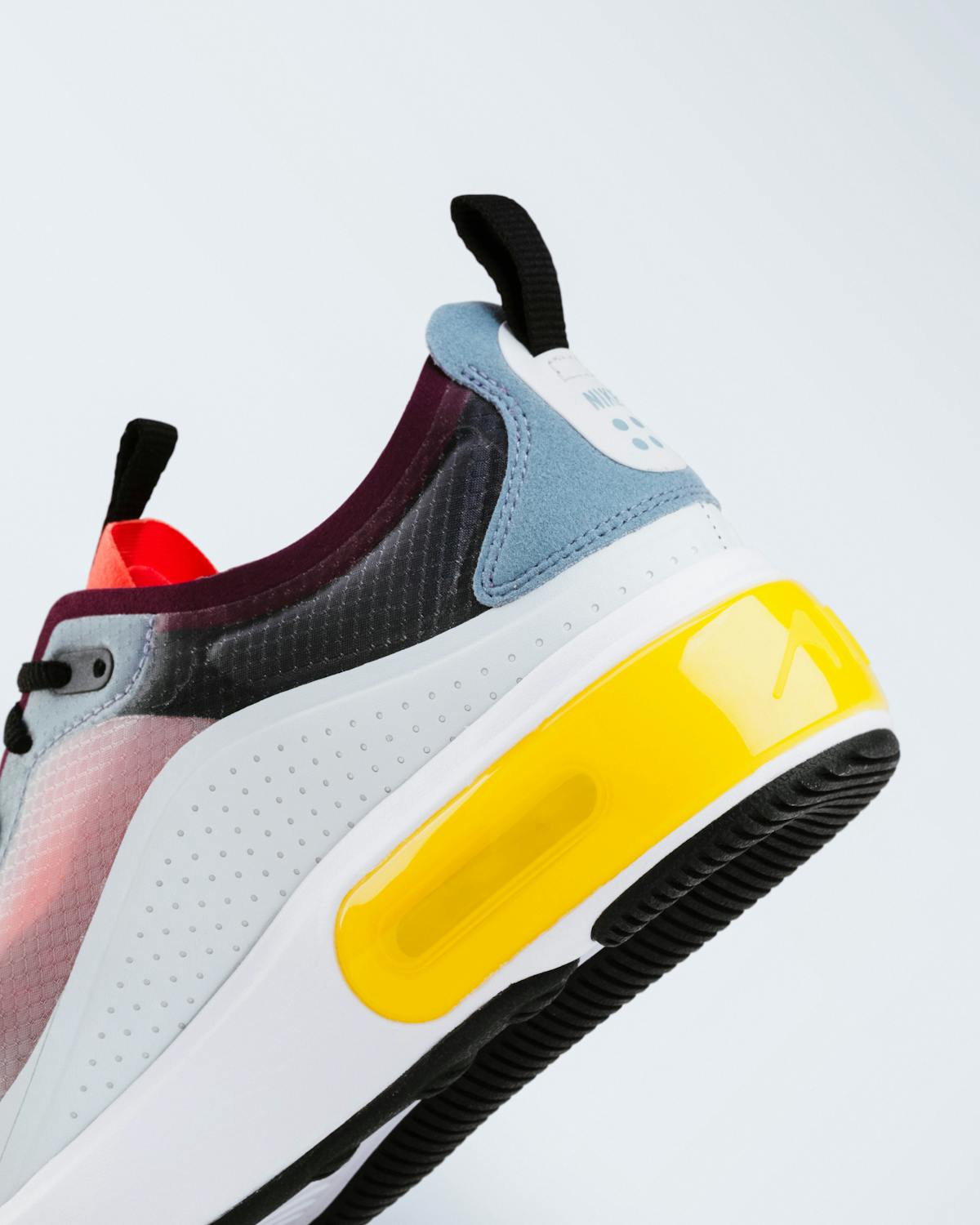
The Swoosh: Nike's Accidental Streetwear Logo
The Nike Swoosh was not designed for streetwear. It was designed in 1971 by graphic design student Carolyn Davidson for $35. But through Nike's dominance in basketball culture, running culture, and eventually skate culture, the Swoosh became streetwear's most visible symbol.
The Swoosh's power is in its simplicity. It does not represent anything specific — Davidson described it as conveying motion and speed. This abstraction allows it to absorb whatever meaning the culture assigns to it. On a basketball court, it means performance. On a streetwear fit, it means cultural affiliation. On a Travis Scott collab, it means hype. The same logo, endlessly recontextualized.
The Logo Explosion: 2000s-2010s
Logomania
The mid-2010s brought a logo renaissance. After years of minimal branding — driven by the normcore trend and the backlash against visible consumption — logos came roaring back. But this time, the logos were the product.
Supreme box logo hoodies reselling for $1,000+. Gucci belts with the interlocking G. Balenciaga tees with the wordmark across the chest. Off-White's diagonal stripes and quotation marks. The logo was not just branding — it was the reason people bought the product.
This era reached its peak around 2017-2019, when wearing a visible logo from the right brand was the most immediate way to signal cultural awareness. Your outfit was a billboard, and the logos were the ads.
Off-White: The Meta-Logo
Virgil Abloh's Off-White deserves special mention because it did something new with logos. The quotation marks around product names ("SHOELACES," "AIR"), the diagonal stripes, the industrial aesthetic — these were not traditional logos. They were design systems that commented on the concept of branding itself.
Off-White treated the logo as a conversation about logos. It was self-aware in a way that Supreme's box logo was not. Whether this was genius or gimmick depends on who you ask, but the influence is undeniable: after Off-White, streetwear logos became more conceptual and self-referential.
The Anti-Logo Movement: 2020s
The Quiet Luxury Backlash
Around 2020-2021, a visible shift began. Visible logos started feeling performative. The quiet luxury movement — driven by brands like The Row, Lemaire, and Bottega Veneta — promoted the idea that truly expensive clothes should not need to announce themselves.
This filtered into streetwear. Brands like Fear of God Essentials found massive success with minimal, barely-visible branding. The Essentials logo — small, neutral, often tonal — was the anti-box-logo. It said "I spent money on this" without screaming it.
The "If You Know, You Know" Era
The current logo landscape in streetwear is defined by recognition hierarchy. The most respected brands use logos that are visible to insiders but invisible to outsiders:
- Aimé Leon Dore's subtle monogram
- Stussy's return to the understated stock logo
- Corteiz's Alcatraz logo — recognizable in streetwear circles, unknown to mainstream consumers
- New Balance's N — a logo so embedded that it reads as design rather than branding
The flex is no longer about wearing a logo everyone recognizes. It is about wearing a logo only the right people recognize. This is exclusivity through knowledge rather than price — arguably a more authentic form of cultural capital.
Logo Design Principles in Streetwear
Simplicity Scales
The most enduring streetwear logos are simple. The Supreme box. The Nike Swoosh. The Stussy S. The Adidas Trefoil. These logos work at any size — on a shoe, on a hat, on a billboard — because they are reducible to their essential elements without losing legibility.
Complex logos — detailed illustrations, intricate type treatments — work on graphic tees but fail as brand marks. They cannot be embroidered on a hat or debossed on leather. Simplicity is what allows a logo to transcend individual products and become a true brand symbol.
Context Creates Meaning
No logo has inherent meaning. The Supreme box logo is just a rectangle with text. The Swoosh is just a curved line. The meaning is created by the culture around the logo — who wears it, where it appears, what it costs, and what stories surround it.
This is why celebrity co-signs matter so much in streetwear. When a respected figure wears a brand, the logo absorbs their credibility. When a brand is seen in the wrong context, the logo absorbs that too. Logos are empty vessels that culture fills with meaning.
Scarcity Amplifies Logos
A logo that appears everywhere loses power. A logo that appears selectively maintains mystique. Supreme understood this instinctively — the box logo appeared on limited items precisely because restricting it preserved its impact.
The best new streetwear brands understand this too. They use their logos strategically, not on every piece in the collection.
The Future of Streetwear Logos
The Pendulum Will Swing
Logomania and logo minimalism cycle back and forth. The current trend toward subtle branding will eventually give way to another logo explosion — probably driven by a new brand or designer who makes visible branding feel fresh again. Fashion is cyclical. Logos are fashion.
Digital Logos and AR
As streetwear intersects with digital culture, logos are evolving beyond physical garments. Digital-first streetwear brands create logos designed for screens first and clothing second. Augmented reality features that activate when you scan a logo are emerging. The logo as an interactive, digital-first element is the next frontier.
The Personal Logo
Social media has turned individuals into brands. Personal logos — for content creators, designers, and style influencers — are becoming as culturally relevant as corporate logos. The line between personal identity and brand identity continues to blur.
What This Means for How You Dress
Understanding logo history helps you dress more intentionally:
- A big logo makes a statement. Make sure it is the statement you want to make.
- A subtle logo signals insider knowledge. But only if people actually recognize it.
- No logo says confidence. It says the quality and fit speak for themselves.
- Mixing logos from different brands is fine — the era of head-to-toe single-brand dressing is over.
The logo on your chest is not just a brand mark. It is a cultural reference, a tribal signal, and a design element that interacts with every other part of your outfit. Choose it intentionally.
Browse the Wear2AM shop for pieces where the design speaks louder than any logo, and check our guide to quality basics vs fast fashion to understand why construction matters more than branding.
RELATED READS

Best Custom Graphic Tee Methods: DTF vs Screen vs HTV 2026
DTF, screen printing, HTV, or sublimation — which method actually works best for custom graphic tees in 2026? We break down costs, gear, and results.
Stussy vs Palace vs Supreme: Who Runs Streetwear in 2026
Stussy, Palace, and Supreme defined streetwear. But in 2026, only one is still leading the culture. We break down where each brand stands right now.
How New Balance Went From Dad Shoes to the Coolest Brand in 2026
New Balance used to be a punchline. Now it is the most respected sneaker brand in streetwear. Here is exactly how that transformation happened and why it stuck.